What to put on your link-in-bio page
Include who you are, one clear next action, and the few links that support it. Order by what a visitor needs now—not by the date you added a link. The right page is often smaller than your complete list of accounts.
A shapes guide, not an independent product review. Examples are illustrative; screenshots show the real application.
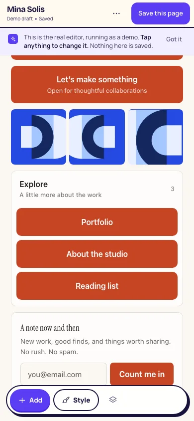
Tell a new visitor where they have landed.
Use the name your audience recognizes and a short description of what you do. A profile photo or recognizable visual can help someone confirm they found the right person. Avoid a biography that pushes the actual links far below the first screen.
The page should make sense even if the visitor did not come from your latest social post. “Handmade ceramics; small batches from my studio” provides context. “Everything is here” leaves the visitor to work out what matters.
Give your current priority a clear label.
Choose the destination most relevant to the audience arriving today. It might be a new release, your available appointments, or a collection that is currently for sale. Give that destination visual priority and use words that explain what happens next.
There is no universal perfect number of links. Start with the smallest useful set, then add a destination when it serves a real task. A page with fifteen clearly grouped destinations can be easier to use than five vague buttons.
- “Listen to the new single” is clearer than “New!”
- “Book a first appointment” is clearer than “Work with me.”
- “Shop the October collection” is clearer than “My stuff.”
For a musician: put the release before the archive.
Illustrative structure: a name and short introduction, the current single or album, upcoming shows, merchandise, and a folder for older releases or press. If the goal of this campaign is ticket sales, swap the main action to the upcoming show.
A music player can help someone sample the work, but keep a plain destination link available. Check that a tour date has not passed and that the ticket page still has the right event. Your bio page should not accidentally feature a show that is over.
- Main action: listen to the current release or book the upcoming show.
- Supporting links: tour dates, merchandise, and an email signup if you maintain one.
- Grouped links: back catalogue, press, and older videos.
For a maker: show what can be bought now.
Illustrative structure: a small gallery of current work, the available collection, shop policies on your existing store, and a contact destination for commissions. A gallery gives visual context; a shop link gives the visitor a next step.
Do not make an old sold-out collection look available. Move past work into a clearly labelled archive or remove its buying call to action. If your shop handles stock, taxes, shipping, and payment, keep those details authoritative there. shapes can point to your shop; it does not process the order.
- Main action: browse the available collection.
- Supporting links: commission enquiries, your shop’s shipping information, or a maintained mailing list.
- Grouped links: past collections and studio background.
For a service provider: separate booking from background.
Illustrative structure: what you offer, who it is for, a booking link, what a first appointment involves, and your contact information. If someone needs a referral or an eligibility check first, say so before sending them to a calendar.
Keep practical details current: location, opening hours, remote or in-person availability, and the difference between a first appointment and a returning-client booking. Do not collect confidential information in a general bio-page form.
- Main action: book the appropriate appointment or make an enquiry.
- Supporting links: fees on your own service site, location, and preparation information.
- Grouped links: qualifications, resources, or background reading when relevant.
Group, archive, or remove what no longer helps.
Use plain group names such as “Past work,” “Listen,” or “Appointments.” Keep the most important destination outside a collapsed group so visitors do not have to search for it. shapes folders group blocks, while tabs group folders when the collection is large enough to justify separate views.
Remove duplicate destinations, inactive accounts, and expired offers. Avoid claiming a link is free if a purchase is required at the destination. An email signup should explain what the person is signing up for; it is not a reason to promise a newsletter you do not send.
Once the page is live, look at actual questions and available analytics before changing everything. A view count is not proof of sales, and a new layout is not a guaranteed conversion improvement. Test one understandable change at a time.